
In today's digital landscape, the majority of emails are opened on mobile devices. If your emails aren't optimized for smaller screens, you're not just delivering a poor user experience. You're likely losing engagement, conversions, and revenue. Mobile-first email design isn't a trend anymore. It's a necessity.
This guide walks you through what mobile-first email design means, why it matters, and how to master it with practical, actionable strategies.
What Is Mobile-First Email Design?
Mobile-first email design is the practice of designing emails primarily for mobile devices before adapting them for larger screens like tablets and desktops. Instead of shrinking desktop layouts, you start with the smallest screen and scale up.
This approach ensures that your emails are:
- Easy to read
- Quick to load
- Simple to interact with
Why Mobile-First Matters
Over 60% of email opens happen on mobile devices. That means your audience is likely reading your message while commuting, multitasking, or quickly scanning. If your email:
- Requires zooming
- Has tiny text
- Loads slowly
...your audience is likely deleting before they even read your offer. Mobile-first design fixes that.
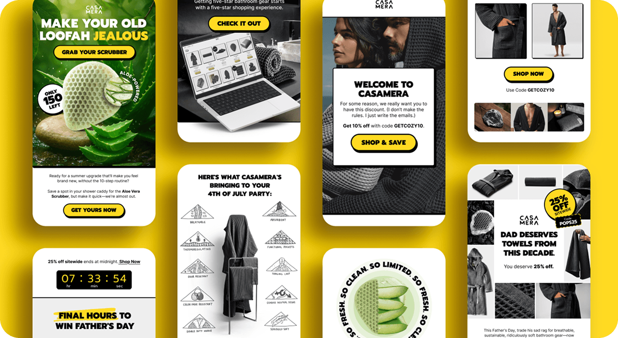
Core Principles of Mobile-First Email Design
1. Keep Layouts Simple
Mobile screens don't have space for complex structures. Use a single-column layout to ensure clarity and flow.
Best practices:
- Stack content vertically
- Avoid side-by-side elements
- Use clear spacing between sections
2. Prioritize Readability
Text must be legible without zooming.
Guidelines:
- Body text: 14-16px minimum
- Headlines: 22px+
- Use short paragraphs (2-3 lines max)
- High contrast between text and background
3. Design for Thumb Interaction
Users navigate emails with their thumbs, so make interactions easy.
Tips:
- Buttons should be at least 44x44 pixels
- Place key CTAs in the center or lower half of the screen
- Add enough padding around clickable elements
4. Optimize Images and Media
Images should enhance, not slow down, your email.
Do this:
- Compress images for fast loading
- Use responsive images that scale
- Include alt text for accessibility
Avoid:
- Large, heavy files
- Text embedded inside images (can become unreadable when scaled)
5. Write Scannable Content
Mobile users don't read. They scan.
Structure content like this:
- Clear headline
- Subheadings
- Bullet points
- Short, punchy sentences
Your goal is to communicate value within seconds. This matters especially in automated sequences — if your Klaviyo welcome flow uses image-heavy layouts that don't render cleanly on mobile, you're losing conversions before the copy even lands.
6. Use Responsive Design Techniques
Even though you design for mobile first, your email should still look good on larger screens.
Key techniques:
- Fluid layouts (percent-based widths)
- Media queries for scaling
- Flexible images and containers
7. Test Across Devices and Clients
Different email clients render emails differently. Always test on:
- iOS Mail
- Gmail (mobile app)
- Outlook
- Android devices
Tools like Litmus or Email on Acid can help preview your designs.
Final Thoughts
Mastering mobile-first email design is about respecting your audience's time, attention, and device limitations. When you prioritize simplicity, clarity, and usability, your emails become more effective, no matter where they're opened.
Start small: simplify one email, test it, and iterate. Over time, you'll build a mobile-first approach that consistently delivers better results. If you want to see how design fits into a full email program, here's what a high-performing Klaviyo account actually looks like.
Remember: If your email works perfectly on mobile, it will almost always work well everywhere else.